
Project
Introduce Voya Financial to those who new us as ING, and redesign the site with current online features and expectations.
Recommendation
Work with marketing, and development teams, refresh the old ING site in a way to bring excitement to a new company, Voya Financial. Touch every aspect: fonts, colors, voice, while streamlining the visual presentation.
UX Components
Competitive Audit
Wireframes
Cascading Style Sheets
Usability Testing
Rapid Prototyping
Heuristic Evaluations
Requirements Documentation
When ING became Voya Financial, it was critical to rebrand all digital assets with their new logo and brand colors. Since that would involve touching every page of the site, I convinced my leaders to let me do an entire site refresh. I simplified the structure, introduced a tighter type hierarchy, and did some usability testing to eliminate any pain points.
Goals
Introduce the new Voya Financial logo and color scheme.
Bring the new “voice” of Voya into the copy.
Streamline the look of the site by bringing it into alignment with current web practices.
Discover and eliminate pain points.
Voya Presents
Rebranding and redesigning a venerable insurance website.
Original Design
The original “ING Presents” website was a highly used, comprehensive site for insurance agents to access information and tools to create proposals for their clients. However, it was stuck in an older era of design. Users will automatically think that a site is easier to use if it has a more modern, attractive design. So, it was time to give it a makeover.

Homepage After Redesign
Through an iterative process the designs were approved by senior leaders and corporate branding. I updated the CSS, simplified the information architecture, flattened the design and added much needed white space. And, the new Voya logo and branding is now loud and clear.

Extending the Brand
Details matter when launching a new brand. So, the same clean, simple design was incorporated into graphs, charts, calculators, pdf files, you name it.

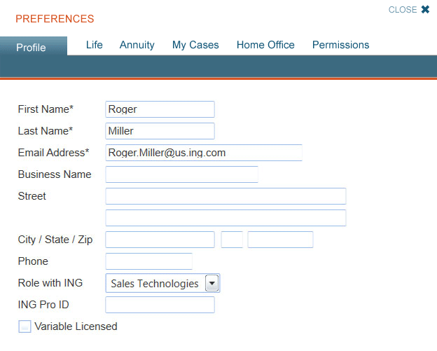
Views & Permissions
With a highly complex tool, access to certain information needed to be restricted based on roles. Through consultations with home office employees, sales leaders, and insurance agents, I designed a Preferences screen to cleanly and clearly allow people to access what they need.
Yes… We Have Requirements
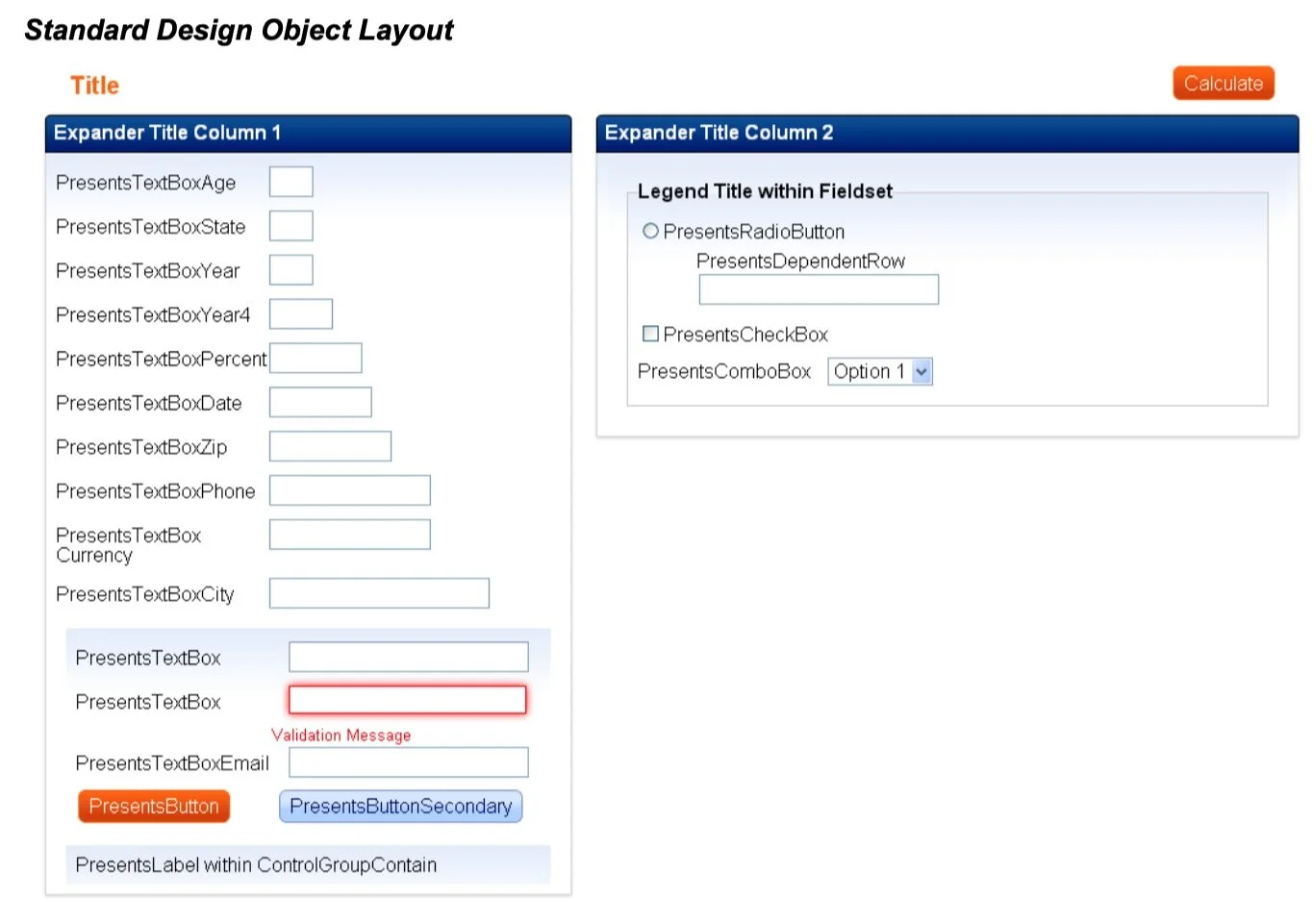
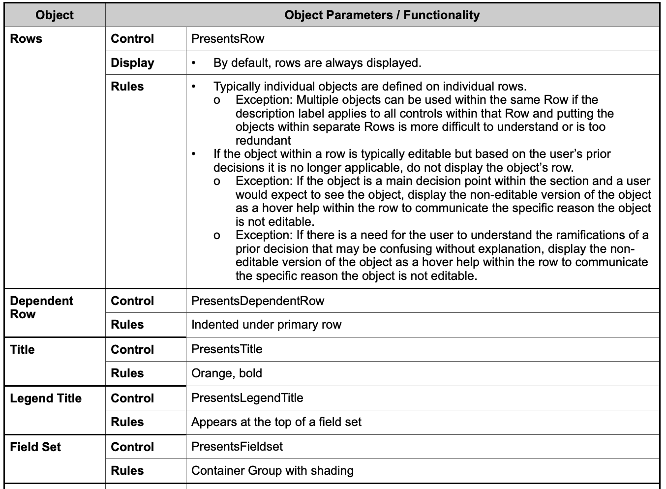
Working closely with insurance subject matter experts and the development team, I created requirements documentation for every page of the site. These utilize UX artifacts and clearly explain functionality to be built by the developers.
Summary
The rebranding of a company is a huge undertaking involving Microsoft Project timelines, gantt charts, documentation, requirements, testing, and release management. Working as both the UX Designer and the Product Manager, allowed me to closely monitor the progress to release the new site to the world. It was an all or nothing proposal - and it was a success!
Next Case Study: Wayzata American Legion