
Project
Refresh a dated user experience and eliminate obstacles to Increase sales.
Recommendation
Simplify and clarify the product description page to accurately reflect the pricing tiers and individual item pricing. Modernize the visual appeal of the site to engage customers, increase time on the site and strengthen conversion.
UX Components
Competitive Audit
Wireframes
Stakeholder reviews
High-fidelity prototypes
Requirements Documentation
Orchard Brands, with three distinct labels, offers a large selection of private-label clothing through eCommerce and catalog mailings. Over many years of updates, the sites needed a thorough review of the product details page to refine and improve the user experience.
Goals
Display clearer pricing.
Reduce scrolling through efficient use of space.
Bring visual UI into alignment with competitors.
Drive sales through cross-selling.
Orchard Brands Product Pages
Refreshing the UI to increase clarity of information and conversion.

Starting Point: Product Description Page
While the basic information is here, it lacks style, clarity, details - and opportunities to engage.
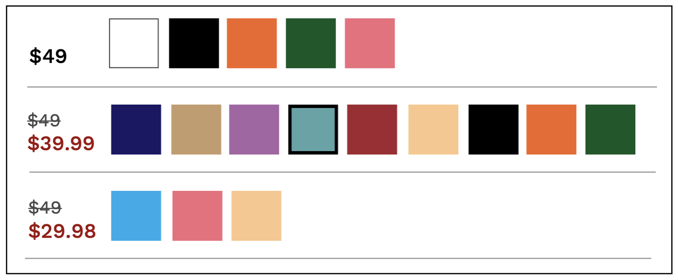
Clarify Price Range by Using Specific Pricing Tiers
There have been several service calls with customers complaining that it is difficult to understand the meaning of the price range listed on an item. Until they select a size and color, they don’t know what the actual price will be. Having items broken down into price tiers will allow the customer to see at-a-glance which colors are at a specific price.
Increase Sales with “Complete the Look” Suggestions
The typical Orchard persona is female, 60 years and older. Tracking their behaviors has indicated their desire to purchase an entire “look” or outfit to make it simple to get dressed for an event. Introducing a section on the product page with outfit suggestions will help them put together a look and may prompt them to complete a larger purchase.

Results
We rolled out the changes using an A/B test of 50% of site views. Comparing the activity before and after these enhancements, we saw an average +30% conversion rate - a positive addition to overall sales.

Summary
Performing regular competitive analysis, UX research and usability studies may uncover ways to better meet customer needs while increasing sales. The modernization of the page, wise use of vertical space, and transparency of pricing has resulted in higher engagement and sales.
Next Case Study: Overhauling Checkout